
UI design: Neumorphism makes a comeback
Cover Image: BMI Calculator App, by Kevin Al-Rizal.
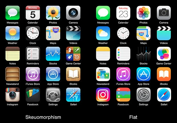
Soft UI or Neumorphism is not really a new trend by any stretch of the imagination. In fact, it was first popularised by Steve Jobs in the 1980s under the name of skeuomorphism and found its way into the design of iOS in the early 2000s. It was all but replaced by flat design in 2006 and was called DOA (dead-on-arrival) by Forbes in 2007.
Fast forward to mid-2020 and the UI design world is abuzz with a new term “Neumorphism” which is politics’ version of Neomodernism. In other words, it’s Skeuomorphism but with its own new hip brand and few tweaks here and there. If you are thinking about building your own app, this new trend could be a design style that suits your product vision.
What is Skeuomorphism?
Put simply Skeuomorphism is a term most often used in graphical user interface design to describe interface objects that mimic their real-world counterparts in how they appear and/or how the user can interact with them. A well-known example is the recycle bin icon used for discarding files. Skeuomorphism makes interface objects familiar to users by using concepts they recognize.
What is Neumorphism?
Well, it’s basically the same but a little more subtle. One might call it mid-way to realism, still working with the more simple and clinical lines adopted from flat design. The combination is a cleaner, more solid look. By using the right kind of shading and highlighting, you’re able to create elements that imitate lifelike objects enough for them to make sense on an intuitive level but still have the otherworldliness that helps the design remain firmly in the virtual world.
But that isn’t all it is
Even though it relates to skeuomorphism, there is a new focus in the entire design style with neumorphism. This focus is not necessarily on the contrast or similarity between the real and digital worlds, but rather the colour palette. Yip that’s right, a key component of neumorphism has to do with the colour of the entire screen which is helping to deliver an entirely new experience for users.
Some say that the fascination with neumorphism began as the trend towards the dark background in UI design began, initially popularised as a solution to the glare of a white screen. The more the trend was embraced the more the idea of creating defined spacing and ‘texture’ for buttons became popular. After all, if the screen was dark how would you make usability better?
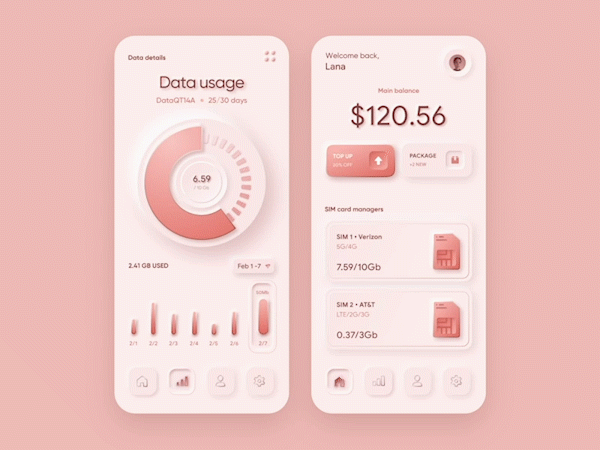
With neumorphism, the idea was to create a soft interface, where it would seem like the UI elements were not placed on the background but rather behind it.
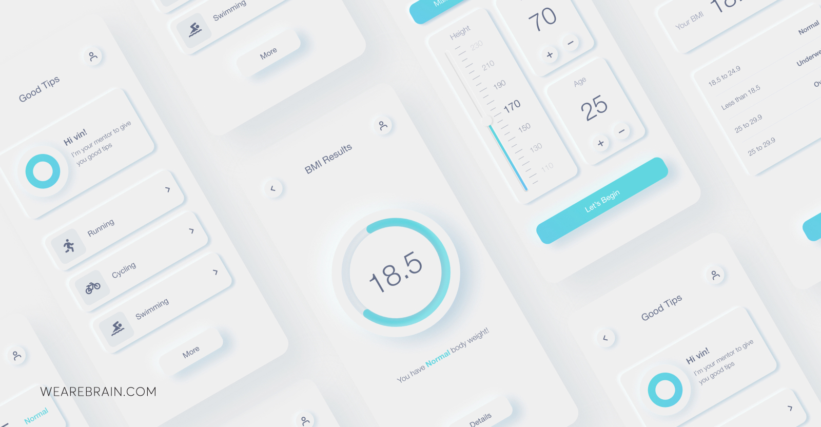
What neumorphism looks like in UI design
Neumorphism is all about subtle contrast and solid colours. But how do you create an interface that delivers a wow-factor without any flashy elements? In neumorphism, it’s all in the use of shadowing and light.
In broad strokes, the main ingredient is making sure that your element and your background are the same exact colour. This is so that we can then create the feel that these components are coming out from inside the background, using shadowing to create the protruding look.
What else is new with neu?
Outside of colour palettes and soft UI in-background design, neumorphism has also taken a different approach to a few other UI elements that make this type of design more engaging and beautiful to look at.
- Shapes: Easily accessible shapes are used and reused where necessary to create an overly repetitive interface.
- Representation: Unlike its predecessor, neumorphism makes use of very mild and subtle effects and does not try to over-represent objects in nature. It creates a new form that appears like a clay render (The 3D designer’s most encountered surface texture) of mostly analogue elements from the old world.
- Effects: Instead of pushing for realism to the max, it uses very accessible effects to HTML and CSS, like Double Drop shadows, Gradients, Fill, Stroke and in extreme cases Inner shadows, all of which can be achieved in their natural code forms by an average developer.
Keen to give it a try?
If you’re keen to give it a shot yourself, we have some good news: UI kits. They can be real time-savers for designers and help them achieve a consistent look.
But when talking about neumorphism, there are some UI kits available for you to use:
1. Neumorphic elements
This UI kit comes with some of the greatest UI components in neumorphic style, those we are all used to. These include radio buttons, regular buttons, tabs, a search bar, a volume bar as well as a few others and what’s more it’s already in HTML. Bonus for coders.
2. Neumorph UI kit
Another great UI kit that makes life easy, by offering the components directly in code. The components already come with some basic interaction such as the expanding dropdown menu.
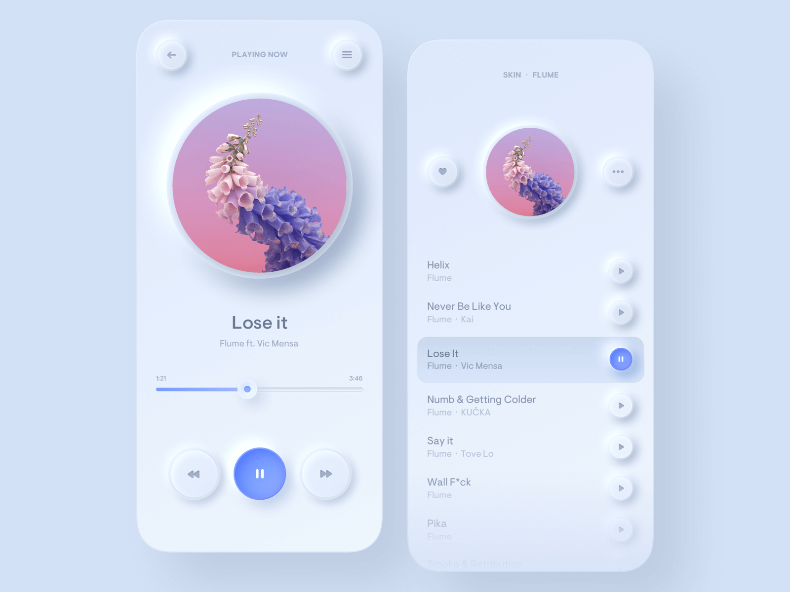
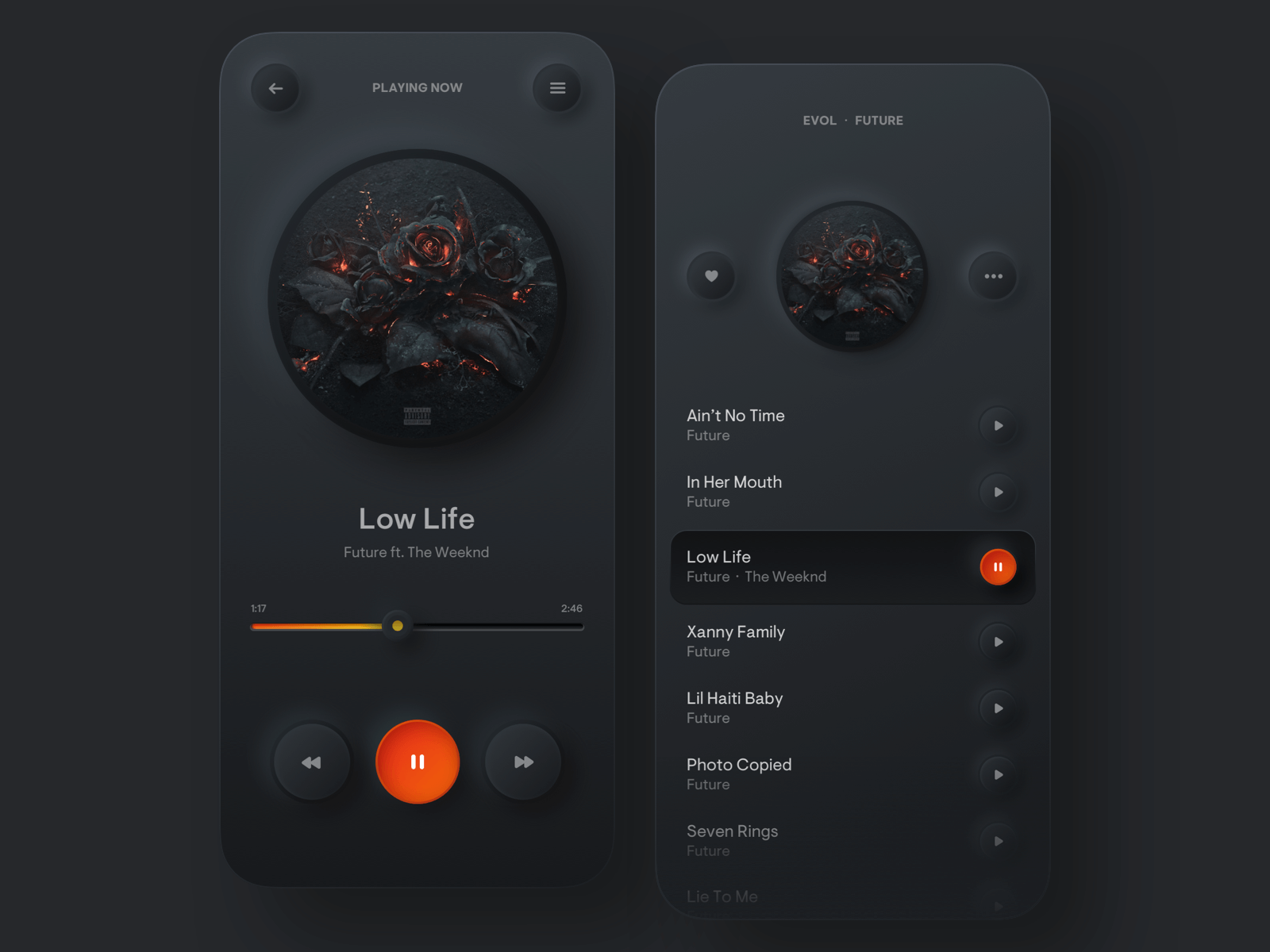
3. Neumorphic UI elements
This UI kit is simple, but sometimes simple works best. The entire UI kit surrounds the concept of a music player, including components like play and fast forward buttons, as well as progression bars, radio buttons and checkboxes.
4. UI/UX elements
UI/UX elements is a UI kit that comes with both the OG’s skeuomorphic elements as well as the neumorphic elements we’re all starting to love.
The Good and the Bad of neumorphic design
Like any trend, neumorphism has its good and bad sides. On the one hand, it brings a great deal of freshness and excitement around something unique and new. Visually it’s really appealing. But on the other hand, and this is the kicker, one of neumorphism’s greatest downfall is usability.
The problem is that there is a very small margin of colours and contrast in which neumorphism works. The slightest deviation in saturation can render the entire raised effect, on which neumorphism is built, a complete failure. Another large, potential failing in neumorphic design is accessibility.
A case can be made for how crucially this type of design may not be workable for the visually impaired. However, a problem that is all the more likely to affect larger portions of users is poor screen quality. For neumorphism to really work, you need excellent clarity for the oh-so-subtle components of neumorphic design to truly pop.
It remains to be seen if this comeback kid will make it out of the start of the new decade as popular as it came in. It does look beautiful and provides depth to UI design like we’ve not seen before. However, accessibility is a big thing to consider when designing a product, especially when you have no control over the screen your app is being viewed through. Is it worth taking the risk of falling flat when flat design seems to be making its big exit?
Anastasia Gritsenko


Working Machines
An executive’s guide to AI and Intelligent Automation. Working Machines takes a look at how the renewed vigour for the development of Artificial Intelligence and Intelligent Automation technology has begun to change how businesses operate.
