
Ingrid Halters, UX Director and Champion
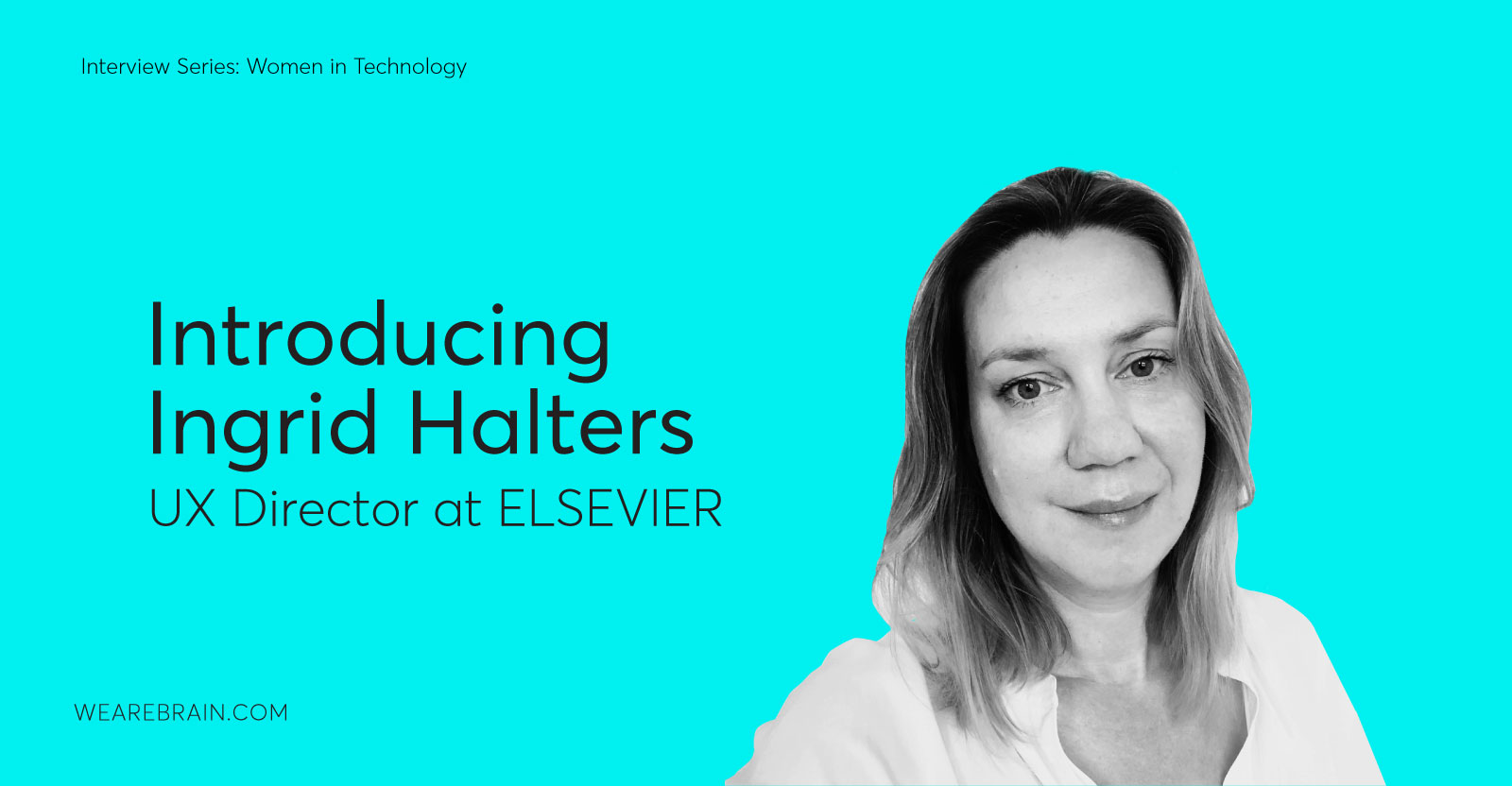
For the next installment of our Women in Tech interview series we had the absolute enlightening pleasure of chatting to Ingrid Halters. As one of the current UX directors at leading information analytics business Elsevier, Ingrid has a wealth of knowledge which she was happy to share with us (and you) in incredible detail. We got a unique insight into just how this creative visionary’s mind works, and we were not disappointed! Here she is in her own inciteful and passionate words.
Q: Where do you work currently, and what is your role?
I’m currently a UX director at Elsevier, leading a team of 25 UX and visual designers, user researchers, and prototypers. We work on platforms enabling scientists to discover and read scientific research. Scopus is an example of a search environment; it indexes the world’s relevant research journals and books, while ScienceDirect is a reading platform for Elsevier journals.
Q: What drew you to the UX field in the first place?
I started out as an industrial designer interested in how technology shapes people’s lives and behaviors. For instance, how large-scale systems, such as road infrastructure and signage influences people’s daily commute and traffic. When I graduated, a recession hit. I ended up at an electrical engineering company, documenting the computer networks of the Dutch Tax Authority using a skunkworks database which generated AutoCad files (that could only be described as spaghetti) which I would then transform into a more readable network diagram. It could easily take me a couple of weeks to get the main Tax office locations in Apeldoorn properly mapped out. When that database needed replacement, I was asked to help design the UI, and that felt like an exciting direction. Around that time, I saw an ad for the User System Interaction program at the Eindhoven University of Technology, offering this great opportunity to expand my knowledge. It turned out to be the right move, as the program exposed me to a variety of technologies, user research methods, different multimodal interaction paradigms — not just designing for websites in a browser on a desktop. I really enjoyed that broad view on UX and had the fortune later in my career to work with speech interfaces and pioneering UX for touchscreens.
Q: What do you believe are the guiding principles of a good UX strategy and good UX design?
Products have to be useful, usable, and delightful. They should empower the users and put them in control. For the user to arrive at that blissful state, the product should be intuitive to use and should be fit for purpose. This means different things in different contexts. Designing products for an in-car environment is obviously very different from designing for scientists at their academic institution. That is why user research is essential; to understand your audience and the context in which people use your product.
To be successful in an enterprise environment, UX teams have to formulate a strategy that supports the business and helps drive value for the organisation by identifying how to be relevant to their audience and drive value for the user.
Q: Many don’t realise that UX is not just about product development but also about all consumer touchpoints. How do you ensure that what your team builds is a real end-to-end solution that serves the user best?
UX teams in large organisations are rarely set up in a way that allows them to achieve a holistic user experience across all touchpoints. When I started out at TomTom, my remit was the user experience of the navigation products. It took a couple of years before we formally got involved with other aspects such as the industrial design of the devices or the corporate website, webshop, and customer support.
However, user research often opens an avenue to engage with other departments in the company and influence the UX of other touchpoints. For example, early on at TomTom I performed an out-of-the-box experience test of our brand-new TomTom GO (2004), where I let people unpack and install the device — we’re talking about an entirely new product category, touch screens are a novelty for almost everyone, four years before the introduction of iPhones in 2008. I was pleasantly surprised to see how even one data point of someone struggling to assemble the device-holder resulted in the product owner ordering the holders to get pre-assembled in the factory. Senior management in TomTom was really engaged and eager to learn how products behaved in the hands of the user and didn’t need convincing why user research is important.
Something that I already early on was able to include in the UX team was the technical writing and localisation experts. We hoped to arrive at a single tone of voice for user documentation, microcopy in the UI, and consistently high quality of localisation. Localisation in our case included more than translating the labels and instructions and also involved designers and researchers — we’re dealing with various metric systems, different road infrastructures, cultural conventions and expectations around driving and traffic, appropriateness of voice talent and so on. We ran studies in the US, India, and elsewhere to understand expectations of car drivers about navigation and their specific contexts. It was yet another area that I found really interesting and rewarding to work in. One of the great things about leading a team is that you get to think about the gaps in the user experience and can then direct the attention of your team to those areas, see creativity in action, and make quick progression in the quality of UX of your products.
At Elsevier, the UX teams are also tied to the Product and Technology organisation; we’re not covering Marketing and Operations, for example, while many of the touchpoints that our users encounter are, in fact, managed by those units. One of the first things I noticed was that Elsevier didn’t have brand digital product guidelines. There were previous attempts at alignment in some areas, but most of it was not appropriate for digital. So, when a new Elsevier Masterbrand strategy was formulated, the question arose how the UX team would deal with it. I volunteered to lead this from a UX/digital design point of view, in collaboration with Corporate Branding. We started really from the basics, providing digital brand guidelines in an accessible, online structure and, in fact, we’re still developing the system and implementing it into products.
Q: What do you believe are the next big trends in the UX field?
There is a growin g awareness of ethics. It is healthy to consider what kind of user behaviours our products encourage, and how we can design more inclusive and sustainable products.
Q: Has big data and machine learning added complexity to UX, or has it simplified it?
Both can be true — when the objective is benign, the technology works well, and there is sufficient accurate data about the people using the system and their context, it can be really powerful and offer the next level of personalisation. The UI becomes almost invisible when the happy path feels as if someone is reading your mind. This experience can be delightful or spooky, depending on your attitude towards technology.
Elsevier has been publishing science for 130 years. We are sitting on top of a mountain of high-quality curated content. The company has been investing in digitising their content since the early ’80s. More recently, Elsevier is transforming from publisher to a provider of analytical and decision-making tools aimed at helping users with a broad range of high-value tasks and problems. Our technology teams use various approaches within the artificial intelligence domain. We use text mining to create structured content, which can be offered to doctors at point-of-care who don’t have time to scan whole articles, they just need to-the-point information on a drug or a condition of a patient. Scopus contains abstracts and meta-information about everything that is published in science. This data is used to generate insights (citation graphs, co-authorship networks) which can be packaged and presented to make people more effective in their work. Performance of authors, academic institutions, and countries can be benchmarked; science domains can be analysed for trends, funders can discover experts in the field to review grant proposals. We use Machine Learning for recommender systems and Knowledge Graphs to show relationships between topics or concepts.
These insights prove to be really useful to the people using our products. It can help them to get to crucial information faster, show relationships they might have missed and, in general, help them be more effective in their daily work.
Our task is to present that wealth of information so that users can make sense of it and act on it. Most designers will appreciate a broad scope and a bit of complexity. The additional challenge lies in establishing trust — people want to know where a recommendation comes from, or what the underlying dataset is. Scientists are, by nature, inquisitive and sensitive to where information is coming from. Transparency is therefore crucial, and quality indicators like metrics serve an important purpose to make quick assessments. Another quality indicator is the brand. Established brands such as Elsevier or one of our other imprints and journal brands are a great asset.
Furthermore, we’re dealing with complicated or unknown edge cases — data served from a database (built up over decades) and thrown on a page can take any shape. It can be a record page with text, a diagram, or some other data visualisation. The resulting page can be almost empty or overwhelmingly full. Large datasets have errors like multiple records for the same entity. How can people evaluate the validity of the data, and even help to improve the dataset if they have the missing piece?
Not every designer enjoys the ‘randomness’ and has the skills to design while keeping all these factors in mind and — depending on where you’re coming from — provide graceful degradation and/or progressive enhancement and successful recovery mechanisms.
Q: For good UX to succeed, you need to make sure you accurately test your assumptions. What role do you believe prototyping and experimenting play in the development of a product?
Indeed, it is about fully using the UX toolbox and being creative with it, often unpicking vague ideas and questions into clear hypotheses. Designing an experiment is a creative challenge. The goal is to create the most lightweight solution to test your assumption. In some cases, a paper prototype will give you an answer (or a clickthrough prototype when you want to test a flow), while in other cases you will need a bit more. I have the luxury to work with both experienced researchers and a few great web developers, capable of building prototypes using real content. We noticed that for some scenario’s users need content that is relevant to them; otherwise, they won’t engage with the functionality in a way that is representative to their normal workflow. For example, we have a fully functional prototyping environment where users can search in their own scientific domain, and then they can read that article which they would typically be interested in.
Q: As a leader and a successful woman in a generally male-dominated space, what are the key take-outs you would share with up and coming UX professionals?
Build your craft; make sure you start with a solid foundation and cover the basics. Make sure you understand the various components that contribute to the user experience, even those you are not in control of or have no background in. When you are in a position to build a UX team, make sure to have both breadth and depth (relevant to your company and audience) in the team. Establish a user research practice and keep building the user research toolbox. Involve the organisation and share your research widely, it provides compelling arguments to increase attention to UX, and when done well, gives focus to where you should put your design efforts first.
Everyone has blind spots, including organisations. It could be that there that your opportunity lies to make a noticeable difference.
There have been moments where being a woman has been in the way to advance my career. It is hard to quantify though; incidents can be explained one way or another. My approach is to try and focus on my work and avoid wasting my energy. What is good about the current awareness and discussion about fair representation is that it also made me more aware of my own behaviors and my own biases.
It is clear from Ingrid’s highly detailed answers that she is an absolute powerhouse of the UX game. Her abilities and widespread knowledge of her craft and the industries in which she has worked are matched only by her unbridled passion for her work. What a truly remarkable and inspiring woman. We will chart your career with eager anticipation, Ingrid. Thank you for your time and careful attention to detail, we have learnt so much!
Anastasia Gritsenko


Working Machines
An executive’s guide to AI and Intelligent Automation. Working Machines takes a look at how the renewed vigour for the development of Artificial Intelligence and Intelligent Automation technology has begun to change how businesses operate.
