
Request a free audit
Take advantage of our complimentary, no-obligation complete audits.
Social media audit Problem definition workshop ISO/SOC readiness
Designing for Augmented Reality (AR): User-centred UX
In the last several years, Augmented Reality (AR) has really started to gain purchase in the technology realm. AR is not new and was, in fact, invented in 1990. It was used by governments and their organisations throughout the nineties and finally hit the public in 2000 with the first AR game being released. It required you to wear a head-mounted display as well as a backpack containing a computer and gyroscopes. Since then, the technology has been refined for modern consumption and in 2016 it hit the mainstream with the invention of Pokemon Go by gaming giants Niantic and Nintendo.
Early critics of AR claimed that it was too bulky and not user-friendly, both from a tech and tool perspective. As the technology has evolved, so has the requirement for a solid UX strategy to ensure that the products are both usable and marketable. But, before we go into the design principles that need to be considered for AR products, it might be worthwhile defining exactly what AR is.
What is Augmented Reality?
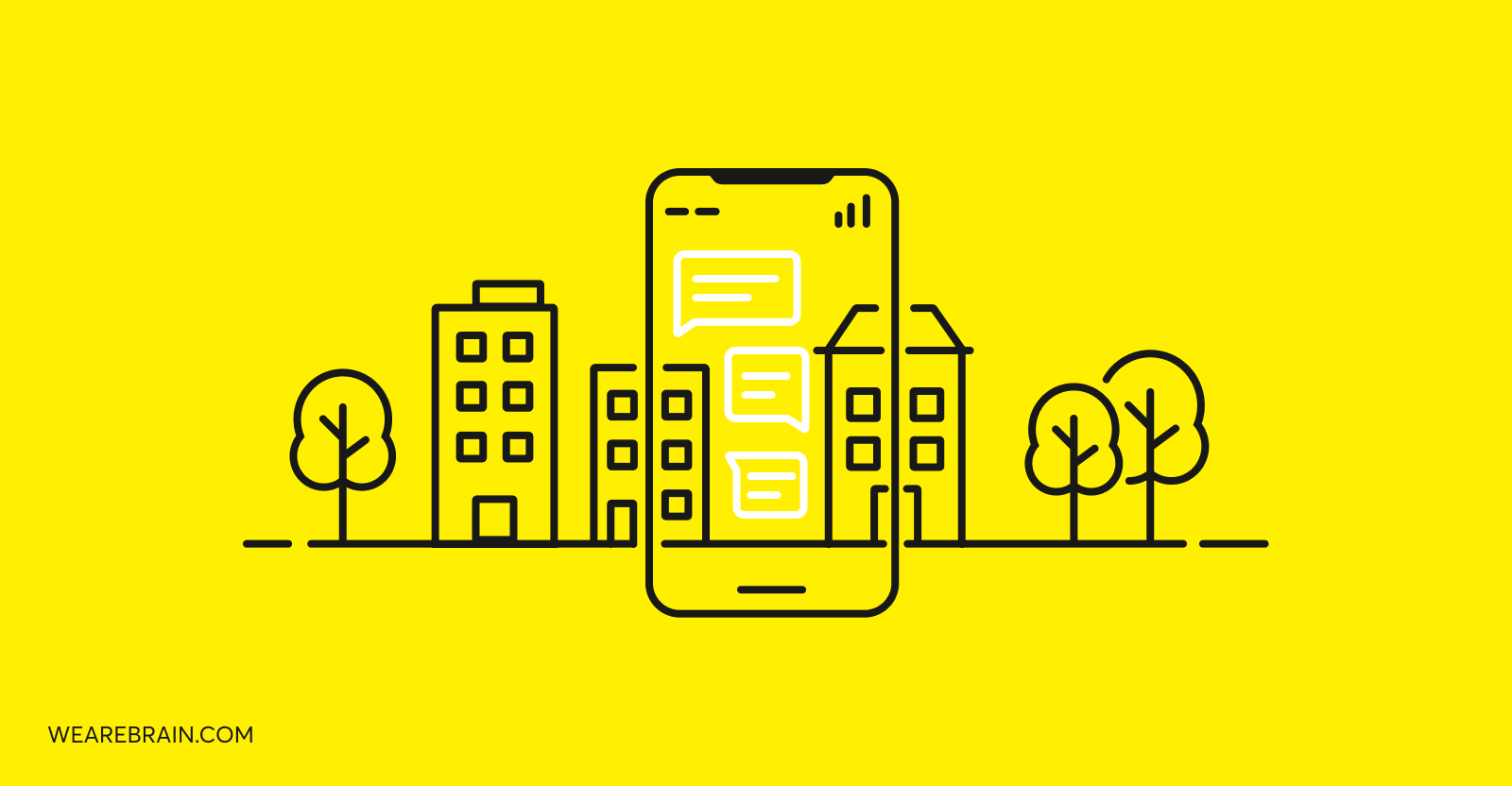
Augmented Reality is a technology that enhances a user’s physical reality with layers of computer-generated images. This helps create a dynamic third level of augmented experience. Unlike virtual reality, which is really more in line with the AR game released in 2000, AR doesn’t require a headset but uses phone camera technology to augment a user’s surroundings. In recent years, after the explosion of Pokemon Go, developers and businesses alike began developing AR app solutions at speed but with varying success.
Outside of gaming, understanding the ability AR had as a marketing tool was initially limited, but as time passed and technology progressed big brands began to incorporate it into their buyer journey. In the retail space, brands like Ray-Ban introduced a ‘Try before you buy’ AR application that allowed potential customers to try on their sunglasses ‘virtually’ on their website prior to buying them. In fact, it’s been noted that customers are 72% more likely to make a purchase after an AR experience.
As you may have already considered, designing for AR apps is significantly different to designing regular web and mobile apps. There is another dimension to the user experience, so UX and UI designers have to be cognizant of this fact when they begin planning an AR app project. AR apps have transformed the user experience from simply just seeing information, to actually being able to interact with it and receive live feedback as they perform each interaction.
In the next section, we’ll look at some key principles of UX for AR app design and see how this differs from traditional UX design practices.
Getting to grips with your objectives
As AR technology improves, more and more businesses will want to play with this shiny ‘new’ toy. However, we would caution you to think very seriously about the problem you’re trying to solve. Frequently, new technologies have been adopted for the wrong projects, which ultimately leads to failure and the technology is discarded. To ensure you don’t find yourself travelling down this path, get your UX and strategy teams to think about the experience they’re trying to build and if AR is actually the right tool to get the job done. Make sure that your AR design is tied very clearly to business and user objectives. Your design needs to add value and not be an added layer of decoration that becomes a barrier to entry.
Environmental design vs interaction design
Generally speaking, when UX designers think about a user’s experience, not a great deal of thought is given to the environment in which a user might be viewing the content in. Certainly the type of device is top of mind, but whether you’re in the living room or a shopping centre very rarely affects how UX designers develop the user-flow. It stands to reason that environmental design takes into consideration this context in which users will be engaging with your application. Suddenly it becomes very important to make the distinction between viewers at home and those who are in-store, for example. It should and will influence things like placement, colour and size.
Accordingly, interaction design refers to how you interact with the context and environment. Your phone screen operates much like a window that you’re able to peer through to view the 3D computational layers that have been designed to create that specific experience.
It’s essential to understand the limitations of the environment and the extent of the interaction required. A great example of an AR app that works well from an environmental and interaction point of view is the IKEA Place app, which allows a user to see what an item might look like in their home by simply pointing their phone in the direction of the space they want the new item to occupy. That’s pretty neat!
Picking up on the right cues
Put quite simply, cues are clues that help the user understand how they’re supposed to interact with your AR app. This means that your cues need to be clear and easy to understand. One of the most incredible parts about AR (if built well), is that there is often a ‘whole world’ to discover. So, ensure that you use on-screen cues to encourage your users to look around and see other elements that might not be directly in front of them. Some UX designers recommend using hover states over buttons, or highlighting interactable elements as a way of getting your user to look around the space they’re in.
Cues are also used for feedback and are an effective way of letting users know there is more to see or do. You can either use visual or audio cues. Most UX designers are quite familiar with visual cues when it comes to design, but in certain circumstances, sound can be an even better cue to help a user notice something off-screen. People have become accustomed to using flat screens so it is up to you to get them to learn to work and interact within this 3D environment.
Think outside of the box
Talking about flat screens, UX and UI developers have become quite accustomed to building their designs within the constraints of a rectangular box. With AR you can utilise the full 360 degrees around you, which can be both exciting and terrifying at the same time. This is where taking into account the environment or context within which a user will be using the AR really comes into play. Understanding these constraints properly will mean you are able to go beyond the borders of your iPhone screen and create a truly entertaining design.
Colour, light and shadow
It should go without saying that the typical elements of design like text and colour are as important with AR app design as they are with any other kind of on-screen design. However there are a few interesting trends that have been adopted in terms of colour treatment that vary from your usual web design expectation. Below we’ve listed some of the design principles used most frequently with AR apps.
- White is the most common colour for text, icons and guides.
- Additional vignettes or gradients are often used in the header and footer to make fixed elements more legible.
- Brand colours are used sparingly or not at all when in camera view.
- System colours outside of the brand colours may be used to reference errors, warnings or completed states.
- Opaque colours are usually reserved for the call-to-action buttons or features such as triggers that may be obscured by the user’s hand.
Within the space of AR app design, the use of light and shadow is particularly important and can be the difference between users finding themselves completely immersed in your design and being bored and ready to move on. When you use shadow effectively, you can make your design feel more substantial while light creates dynamism and makes the environment feel more real. The best possible positioning for your light ‘source’ should be at 12:00 midday.
Design for comfort
Finally, while you are suddenly given a blank slate to design worlds on, it’s important to always be aware of your users’ comfort. Spatially, they are experiencing something different and it’s quite easy to look silly when using AR. As such, there is an overwhelming need for empathy in AR design. Putting yourself in the space of the user and understanding whether or not engaging with your app is psychologically appealing is very important. People fear being embarrassed and trying something new can be intimidating, so be aware that if your product is supposed to be used in public then what are the limitations you might find based on people’s willingness to try something new.
Some food for thought
Augmented Reality is still, to this day, an emerging technology. It will be fascinating to see how it develops and how it will be incorporated into daily living. However, for the meantime, if you’re a UX designer in the AR space it would be a good idea to keep these simple principles in mind when you begin your next AR project.
Martijn Hinfelaar


Working Machines
An executive’s guide to AI and Intelligent Automation. Working Machines takes a look at how the renewed vigour for the development of Artificial Intelligence and Intelligent Automation technology has begun to change how businesses operate.
